Reducing Drop-Off at a Critical Booking Step.
Data interrogation, journey mapping & MVP prototype design.
The Problem.
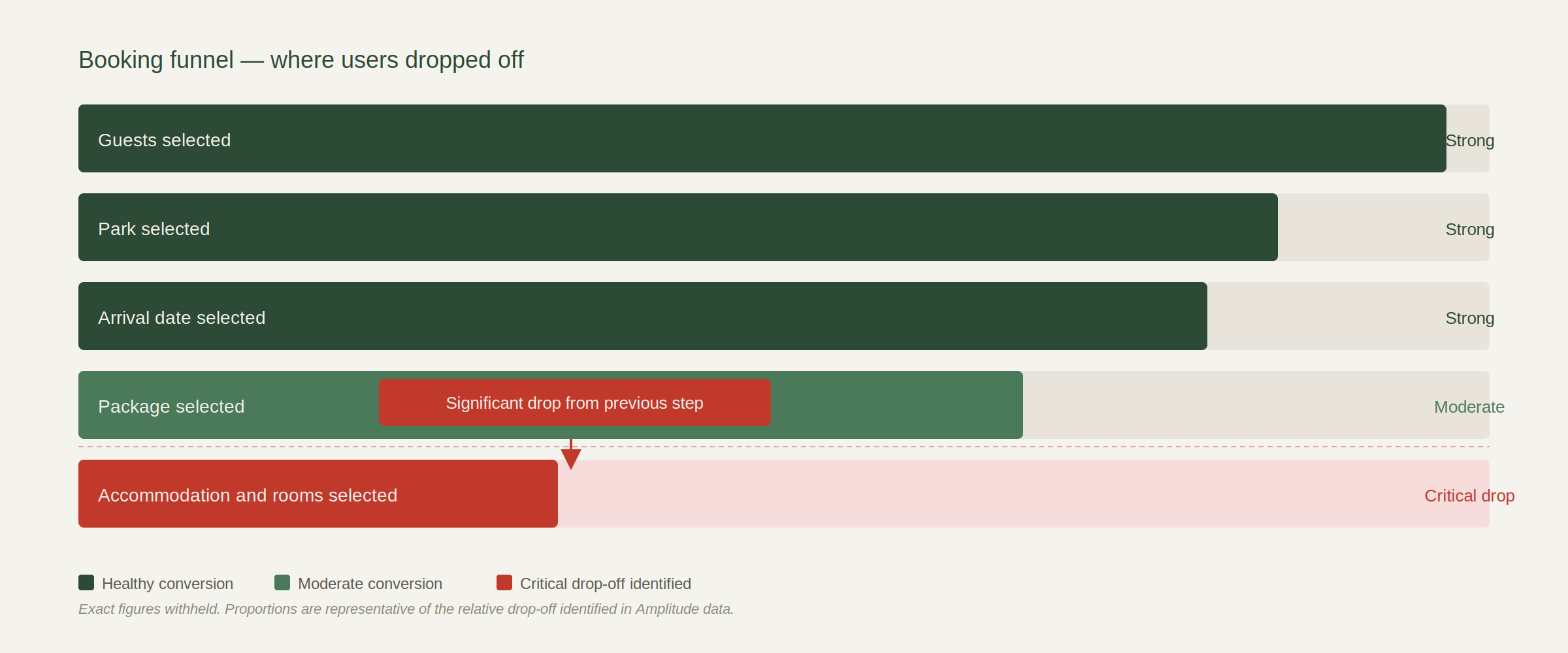
Behavioural data revealed a significant and consistent drop-off at the accommodation and room selection step of the booking journey, one of the most commercially critical points in the funnel. Users were abandoning at a stage where intent was already high. The problem wasn’t acquisition, it was experience.
The objective was to identify the root cause of the drop-off using Amplitude and supplementary behavioural data, map the full end-to-end journey to understand surrounding context, and design an MVP solution ready for stakeholder alignment and sprint consideration. All within a defined delivery window.
What the data couldn’t tell us was why. That bit required design thinking, not dashboards.
I led this end to end, working alongside a product manager and two engineers as part of a three amigos agile structure.

The Approach.
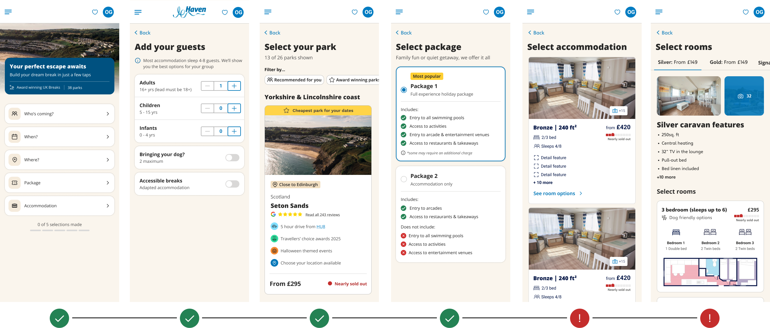
Starting with Amplitude, I interrogated the behavioural data to pinpoint exactly where in the accommodation and rooms flow users were dropping. This surfaced the single biggest point of abandonment, users reaching the accommodation card but not proceeding to room selection, giving us a precise, data-evidenced problem statement rather than working from assumption.
With the drop-off quantified, I mapped the end-to-end search and booking journey to understand the surrounding context: what users had already done, what information they had, and what was being asked of them at the point they dropped off. Previous experiments were reviewed to avoid duplicating approaches that had already been tested.
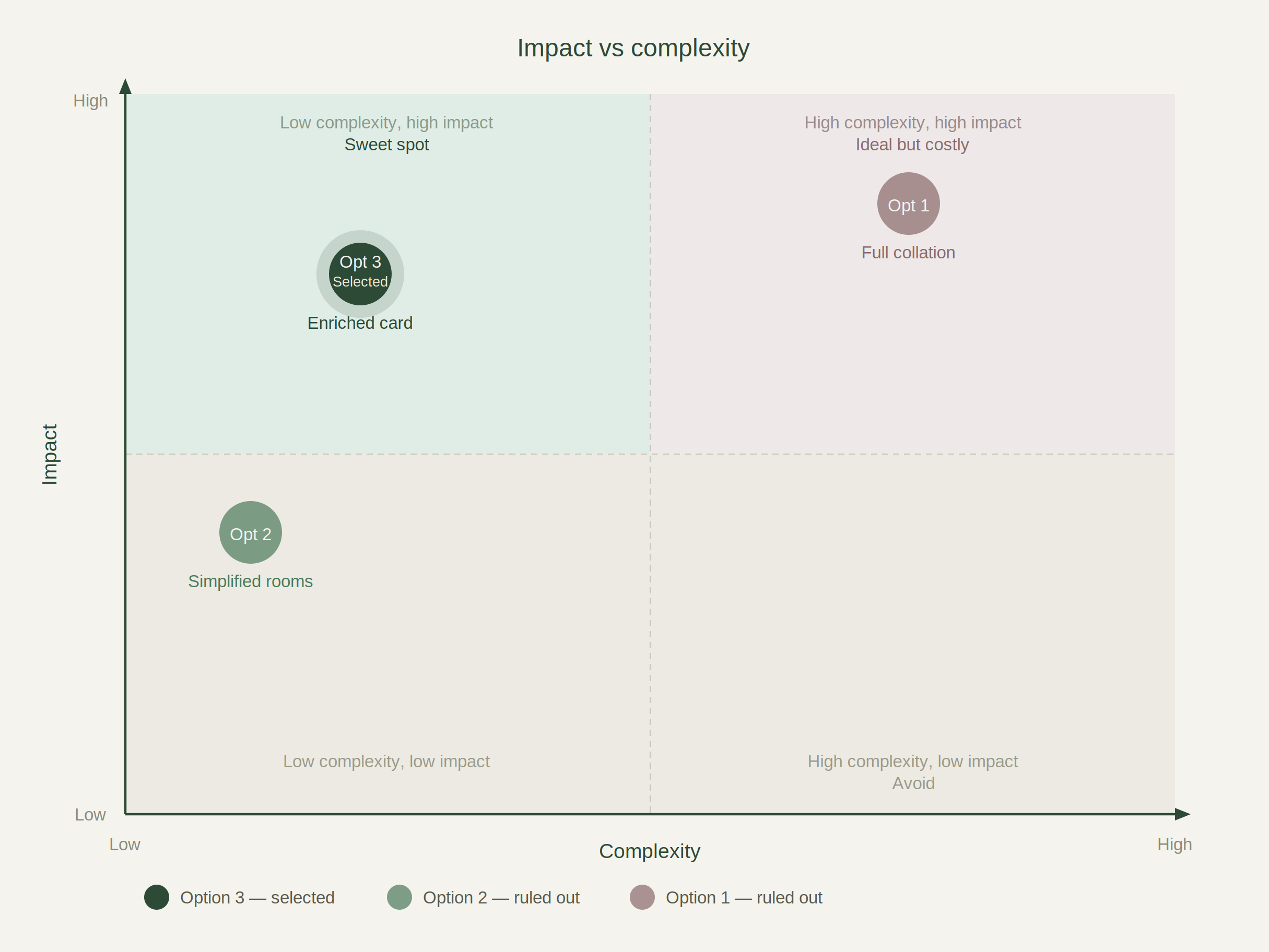
Three solution directions were explored across a complexity spectrum, and this is where it got uncomfortable. The full collation option was the most impactful on paper. Merging accommodation and rooms into a single step would eliminate the drop-off point entirely. But it was also the highest-risk option in a funnel that was already fragile, and it would have consumed sprint capacity we didn’t have. The temptation was to recommend it anyway because it was the most elegant answer. I didn’t.
Working With Reality.
This didn’t happen in a vacuum. There were competing sprint priorities, a product roadmap that wasn’t going to move, and stakeholders who each had a different view on what the right fix looked like. Engineering capacity was limited. The CRO team had their own testing queue. Product were balancing this against three other live workstreams.
The solution had to work within all of that, not just in theory. A recommendation that ignored those constraints wouldn’t have got off the ground, regardless of how right it was on paper. Good design in a real product team means knowing which battles to take to the table and which to document for later.
The Moment It Wasn’t Obvious.
Three options were on the table:
1. Full collation of accommodation and rooms into a single step, highest complexity, highest potential impact
2. Simplified rooms page with non-essential content removed, quick to test, lower risk
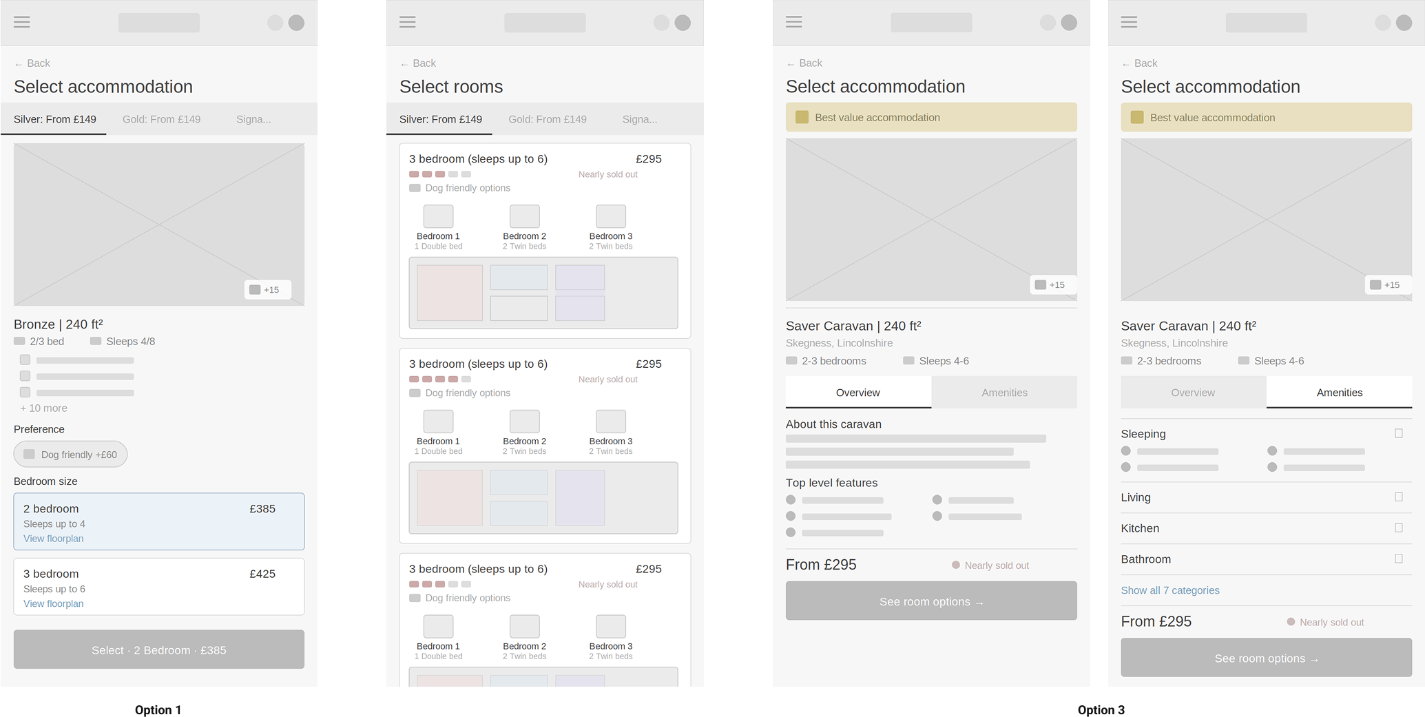
3. MVP enriched accommodation card, key room information surfaced on the card itself
Option 1 was the right answer in an ideal world. This wasn’t an ideal world. The engineering effort was significant, the sprint window was fixed and the funnel was already under pressure from other ongoing tests. Recommending the most ambitious solution would have felt decisive. It would also have been wrong.
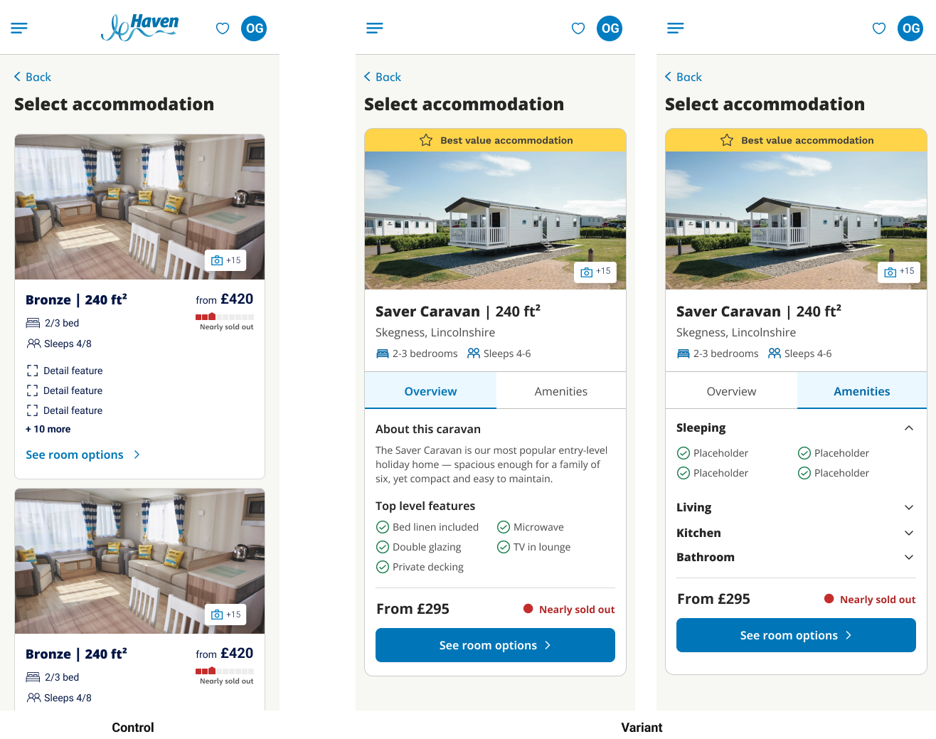
Option 3 was selected, not because it was the safest choice, but because it was the most testable, the most contained, and the most likely to produce a clear signal in the time available. The rationale for ruling out Options 1 and 2 was documented explicitly, so the decision could be revisited rather than repeated.
The Outcome.
An MVP prototype of the enriched accommodation card was built and demonstrated to a cross-functional group including product, engineering and CRO stakeholders. The prototype surfaced key room information directly on the accommodation card, reducing the need for users to navigate to a separate rooms page before committing to a selection.
The solution was presented with full supporting documentation: the identified drop-off point, journey map, rationale for the chosen approach over the alternatives that were considered and ruled out, and prototype. The output was ready for sprint consideration and A/B test design.
It wasn’t a rubber stamp. There were questions about whether the card treatment would create new problems further down the funnel, and a legitimate challenge from engineering about whether the data payload required was feasible within the existing architecture. Both were fair. Both were worked through in the room. The recommendation held.
The documentation of what wasn’t chosen, and why, proved as useful as the recommendation itself. It meant the team wasn’t starting from scratch if the MVP test produced an inconclusive result.
What I’d Do Differently.
Given more time, I’d have run at least one round of user testing on the enriched card concept before presenting it as the recommendation. The data told us where the drop-off was. It didn’t tell us whether the card treatment would actually feel right to a user in the moment. That’s a gap I’d close earlier next time.
I’d also have pushed harder to get the rooms page into scope alongside the card. The two are connected. Fixing the card without touching the rooms page means you’re solving half the problem, and the test results will reflect that. The constraint was real and I stand by the decision made at the time. But if I were starting again I’d have made that case more forcefully at the scoping stage rather than accepting the boundary as fixed.
What Comes Next.
Shipping the MVP was the starting point, not the finish line. The enriched accommodation card was designed to be testable quickly, but the data from that test would open up the next set of questions. Does surfacing room information on the card reduce drop-off enough on its own, or does the rooms page itself need a parallel rethink? Does the fix hold across different accommodation types and park sizes, or does it perform differently at scale?
Time to explore what iteration two could look like. A more progressive disclosure model on the card itself, a reimagined rooms page that complements rather than duplicates what the card already shows, and an earlier filtering mechanic that helps users self-select accommodation type before they reach the card at all.
None of these were in scope for the sprint. All of them were documented and handed over. Good design doesn’t end at delivery, it sets up the next conversation.