Find a Locksmith. Fast.
UX and UI design for a geo-locational mobile app connecting users with certified locksmith professionals.
The Problem.
Being locked out is a high-stress, time-critical situation. Users need to find a reliable, nearby locksmith quickly, with enough confidence in who they’re calling to hand over access to their home, car or business. The existing market was fragmented, opaque and difficult to trust.
The design challenge was to solve a real-world urgent need through a mobile experience that felt fast, reliable and trustworthy under pressure. The technical complexity was significant. Geo-locational accuracy, real-time availability, notifications and regulatory compliance all needed to be built into the experience without adding friction for a user who is already stressed and needs help immediately.
I worked on this as a freelance designer, responsible for the full UX and UI across both sides of the platform, the consumer experience and the locksmith-facing product.
Designing Under Pressure.
The context of use is what makes this product genuinely different to design for. Most mobile apps are used by people who are relatively calm, have time to make decisions and can recover from a confusing screen without consequence. A lockout app is used by people who are cold, frustrated, possibly unsafe, and need the right answer immediately.
That context shaped every decision. The number of steps from opening the app to a confirmed locksmith on the way had to be as short as possible. Error states needed to be clear and actionable rather than generic. The visual hierarchy on every screen had to surface the single most important piece of information first, because a user under stress doesn’t scan, they look for the one thing they need and stop.
The temptation with a product like this is to add reassurance through feature richness. More information, more options, more social proof. In most contexts that would be right. Here it was wrong. Too much information on a screen when someone is locked out at midnight doesn’t reassure them. It overwhelms them. The design had to earn trust through clarity, not volume.
Working With Reality.
The two-sided platform was the most complex design constraint on the project. The consumer experience and the locksmith experience are two fundamentally different products with different user needs, different contexts of use and different definitions of success. Designing for both within the same product without either feeling underdeveloped required clear decisions about where the two sides connected and where they needed to operate independently.
The compliance and accreditation requirements added a layer of design complexity that doesn’t exist in most consumer apps. Verification flows, accreditation status displays and the signals that communicated trustworthiness to a consumer all had to be designed carefully. Getting this wrong wasn’t just a UX problem. It was a trust problem, and in a product where users are handing over access to their home, trust is the product.
Real-time notifications were a critical part of the experience that turned out to be harder to design well than expected. The job isn’t just sending a notification when the locksmith accepts. It’s managing the user’s anxiety across the full waiting period, which can be thirty minutes or more. Designing a notification sequence that kept users informed without overwhelming them required careful thinking about timing, content and tone at each stage.
The Approach.
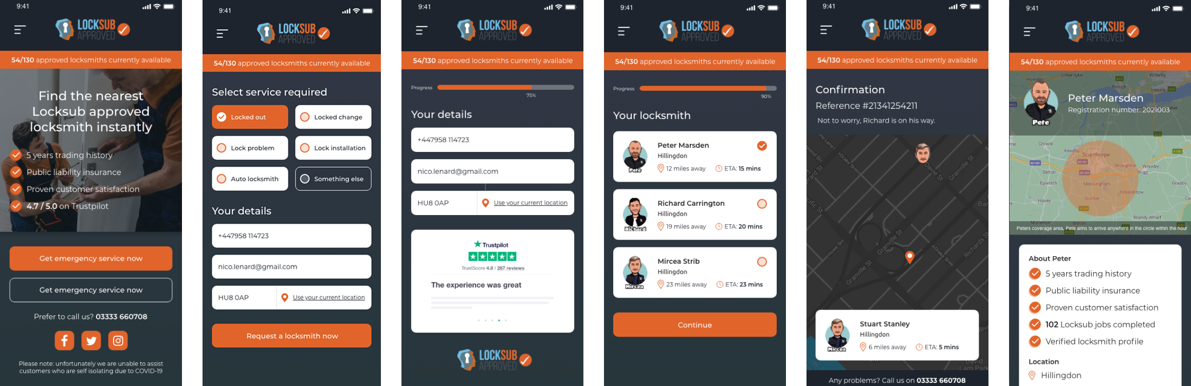
Geo-locational search was the product’s primary function and the starting point for everything. Location permissions, proximity sorting, real-time availability and map-based discovery were all integrated in a way that felt native rather than bolted on. The design accounted for the full range of urgency states, from a casual search for a trusted local locksmith to an immediate lockout emergency.
Trust was built into the information architecture itself rather than added on top as a design layer. Certification status, verified reviews, response times and pricing transparency were surfaced early in the search results rather than buried in individual profiles. The decision to show this information at the list level rather than the detail level was a deliberate one. A user under stress doesn’t open ten profiles. They look at the list and make a call.
The locksmith-facing product needed to be equally well considered. A locksmith who misses a job notification or struggles with the acceptance flow is a failed connection on the consumer side. The professional experience was designed to be fast, clear and reliable, with job details surfaced immediately and the acceptance action prominent and unambiguous.
The Outcome.
Locksub launched to a strong response from both users and locksmith professionals on the platform. The geo-locational search experience connected users with certified, nearby professionals in a way that was fast, transparent and trustworthy, delivering on the core product promise under real-world conditions.
Both sides of the platform performed well. Users found and booked locksmiths with minimal friction, while professionals benefited from a streamlined job notification and acceptance flow that reduced missed connections and improved response rates.
Development continues with the next phase of features building on what the initial release established.
What I’d Do Differently.
The notification sequence was the area I’d spend more time on if starting again. We designed a logical sequence of updates across the job lifecycle but logical and reassuring aren’t the same thing. I’d have wanted to test the notification content and timing with users who had actually experienced a lockout, because the emotional state of someone waiting for a locksmith at midnight is something you can reason about but can’t fully anticipate without research.
I’d also have pushed harder to spend time with locksmiths in the field before designing the professional-facing product. The consumer side was informed by a clear understanding of the user’s context. The locksmith side was designed from a more abstract understanding of their workflow. The two products needed to be designed with equal depth of insight and I’m not sure they were.