Four-Variant Prototype Testing for an Optional Upsell Tool on a Major Holiday Booking Platform.
Research planning, prototype design & unmoderated user testing across four variants.
The Problem.
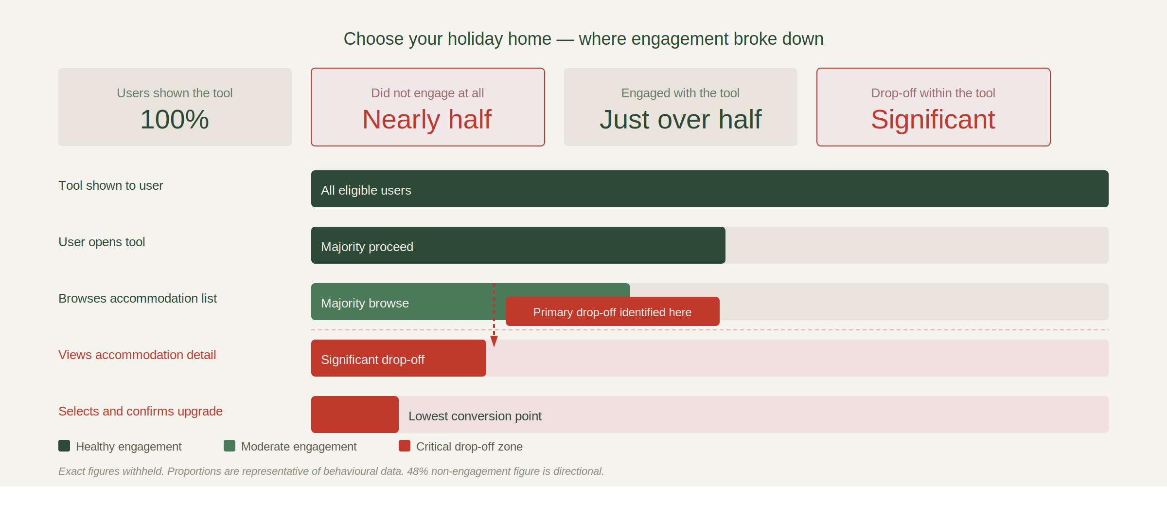
An optional paid upgrade in the checkout journey allowed customers to select their specific holiday home on a park for an additional cost. Despite being shown to eligible users, 48% did not engage with the tool at all. Of those who did, significant drop-off occurred at the accommodation detail stage.
The data told us where users were leaving. It couldn’t tell us why. The challenge was to understand the behavioural reasons behind the drop-off and design testable solutions that could improve both engagement and conversion of the upsell, without disrupting the wider booking flow.
I led the research design, prototype build and analysis end to end, working alongside the product manager and CRO lead to scope the test and define success criteria.
What We Were Actually Trying to Find Out.
Before designing anything, the research question had to be right. A vague question produces vague findings and vague findings don’t move anything forward.
The question we landed on was this: at which point in the choose your holiday home journey does confidence break down, and what information or interaction model would restore it?
That framing mattered. It told us the problem wasn’t necessarily the tool itself, it was confidence. Users weren’t leaving because they didn’t want to choose their holiday home. They were leaving because something in the experience was making the decision feel harder than it needed to be. That shaped every prototype variant that followed.
The Approach.
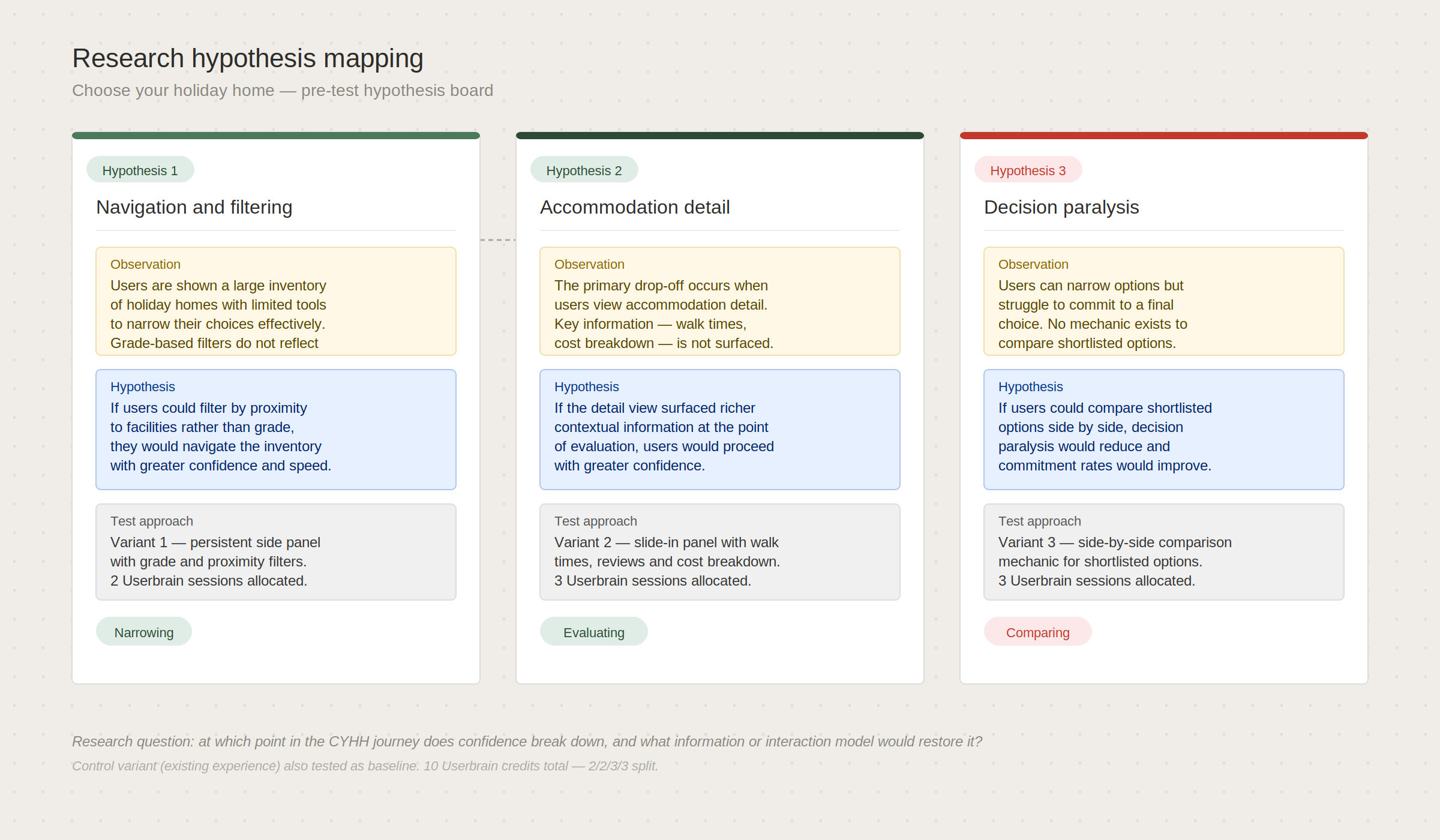
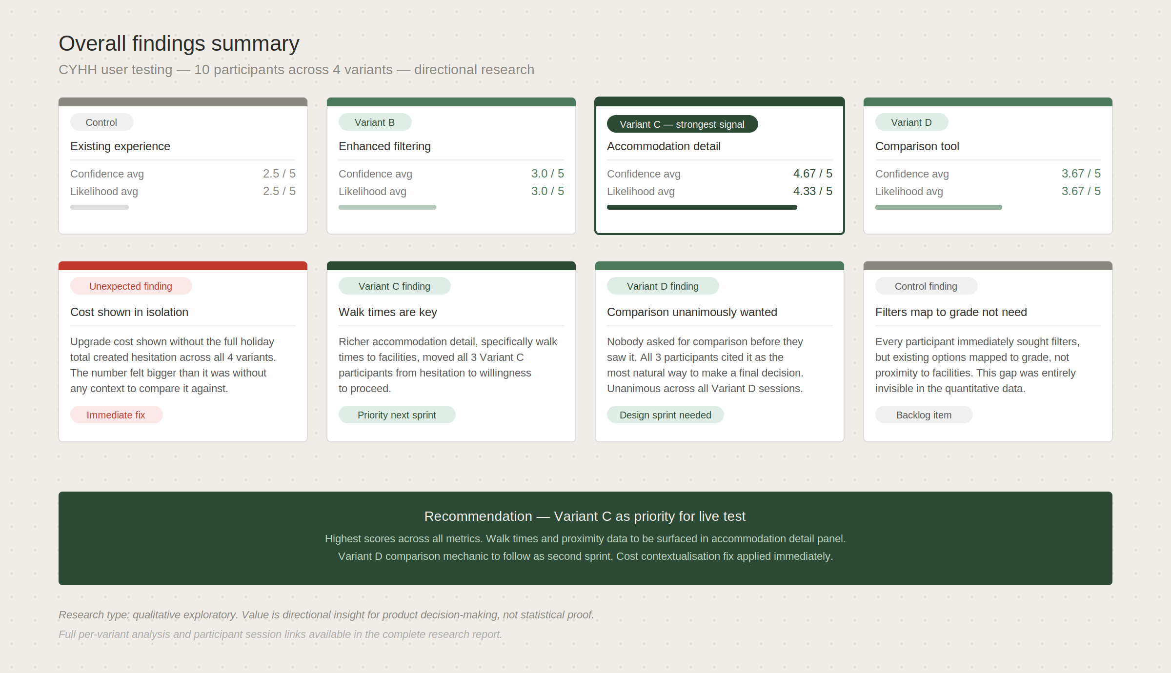
Four prototype variants were designed in v0, each targeting a specific behavioural hypothesis identified through data analysis and journey review. Rather than testing one solution, the approach framed the variants as targeting three distinct stages in the decision journey, narrowing, evaluating and comparing, with the existing experience as a control baseline.
Control — the existing experience, used to establish a behavioural baseline and surface friction in the current flow.
Variant 1: Enhanced Filtering — a persistent side panel with grade-based filtering, allowing users to narrow by accommodation type and proximity to park amenities. Targeting users who struggled to navigate a large inventory without structured tools.
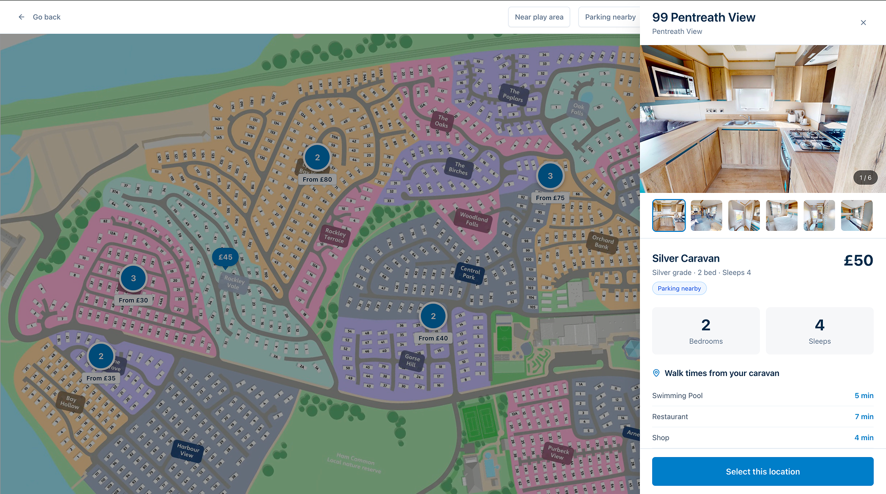
Variant 2: Enhanced Accommodation Detail — a richer slide-in panel showing walk times to facilities, guest reviews, cost breakdown and flexible booking signals. Targeting the confidence gap at the point of evaluating a single option.
Variant 3: Comparison Tool — a side-by-side comparison mechanic for shortlisted options. Targeting decision paralysis for users who could narrow their choices but struggled to commit.
Ten Userbrain credits were allocated across all four variants, with a 2/2/3/3 split favouring the two variants with the strongest data signal. Testing scripts were written individually per variant with consistent closing rating scales across all four to enable cross-variant comparison.
Writing the Script.
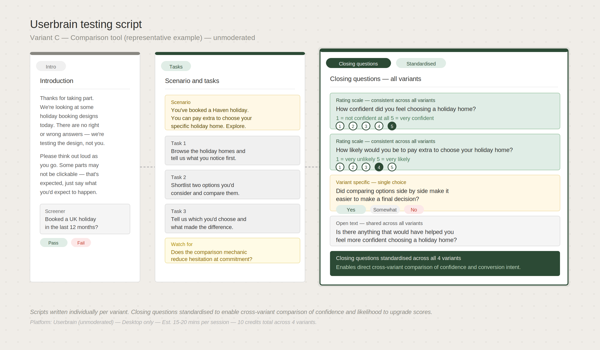
Each variant had its own testing script, written to surface the specific hypothesis being tested without leading the participant. That balance is harder than it sounds. Too vague and participants don’t engage with the feature you’re trying to test. Too specific and you’ve already told them what to think about it.
The scripts were structured around a consistent task: find a holiday home you’d be happy to book, and talk through your thinking as you go. Variant-specific prompts were added only where the interaction was genuinely different enough to need orientation. Closing questions were standardised across all four, covering confidence, clarity and likelihood to proceed, so findings could be compared meaningfully rather than just anecdotally.
The decision to use unmoderated testing via Userbrain was deliberate. Moderated sessions would have given richer qualitative data but the turnaround time didn’t fit the sprint. Unmoderated testing with a tight script got us useful signal within 48 hours.
Working With Reality.
Ten Userbrain credits sounds like a lot until you’re trying to split them across four variants and get statistically meaningful signal from each. It wasn’t enough to be definitive. It was enough to be directional, and directional was what the sprint needed.
There was also a conversation about whether four variants was the right call at all. The argument against was that spreading ten sessions across four prototypes gives you roughly two to three sessions per variant, which isn’t a sample size anyone would write a research paper on. The argument for was that we weren’t trying to prove anything, we were trying to find out which direction was worth proving. Those are different jobs and they need different approaches.
The Userbrain access itself was something I had sourced and funded personally after the tooling request went unanswered. That context matters because it meant the research happened at all.
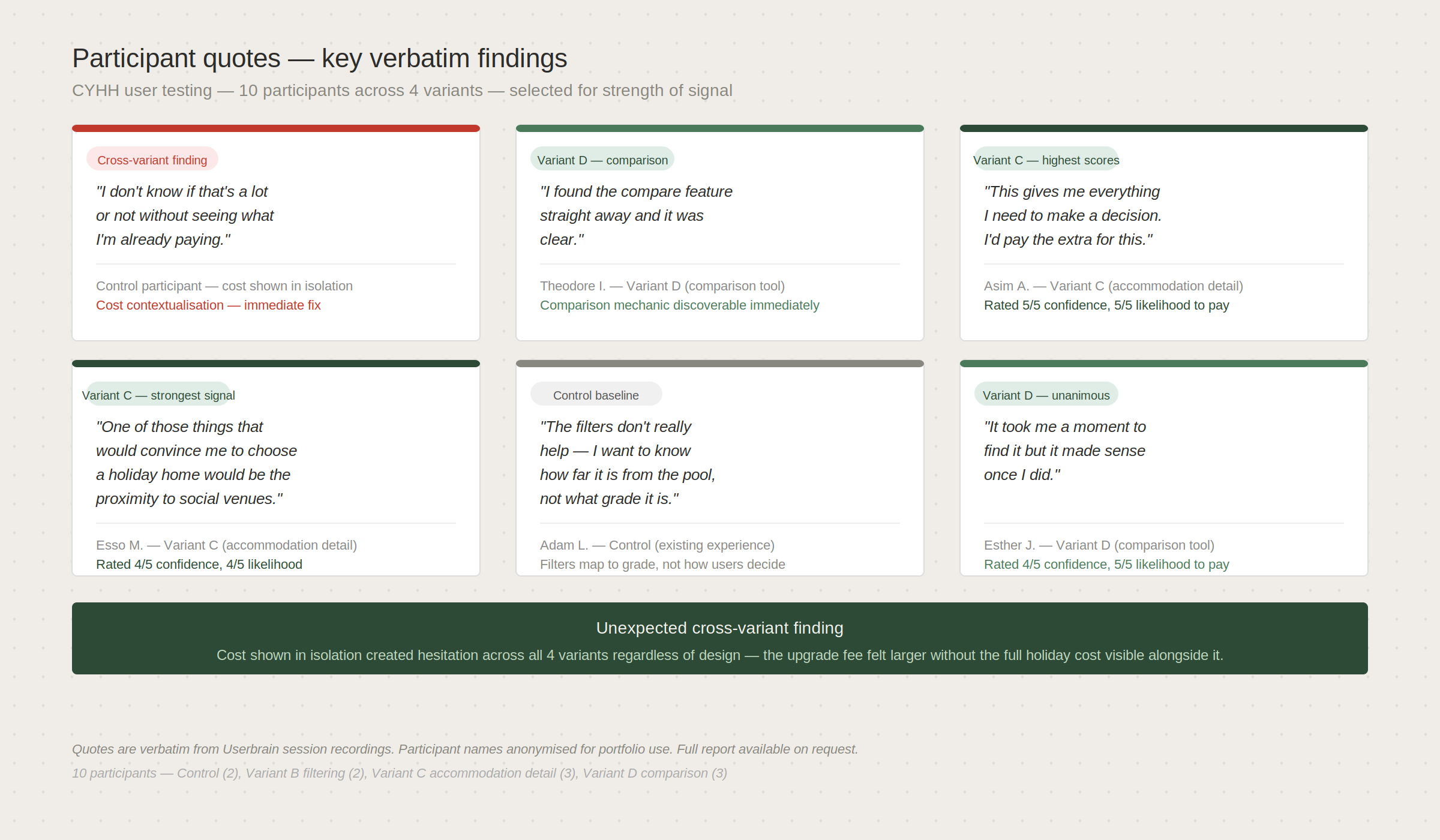
What Participants Actually Said.
The findings were consistent enough across variants to be useful, and surprising enough in places to be genuinely interesting.
Filters in the control experience were sought immediately by almost every participant, but the existing filter options didn’t map to how users actually made location decisions. They thought in terms of distance to facilities, not accommodation grade. That gap wasn’t visible in the quantitative data at all.
Variant 2 produced the clearest confidence shift. Richer accommodation detail, specifically walk times to facilities and a visible cost breakdown, moved participants from hesitation to stated willingness to proceed more consistently than any other variant. The information wasn’t new. It just hadn’t been surfaced at the right moment.
The comparison mechanic in Variant 3 was unanimously well received. Every participant cited it as the most natural way to make a final decision. Nobody asked for it before they saw it. Everyone wanted it once they had.
One finding cut across all four variants and wasn’t in any of the hypotheses going in. Showing the upgrade cost in isolation, without the full holiday cost visible alongside it, created hesitation regardless of which variant participants were in. The number felt bigger than it was because there was nothing to contextualise it against.
The Outcome.
Findings were documented in a full research report with per-variant analysis, cross-variant themes, direct participant quotes and prioritised backlog recommendations. The report provided a clear, evidence-based foundation for product and CRO decision-making on the next iteration of the tool.
The cost contextualisation finding was called out as an immediate fix, something that could be addressed without waiting for a full variant to be built and tested. That kind of finding, one that sits outside the original scope but is clearly actionable, is one of the things unmoderated testing is good at surfacing because participants say what they’re thinking in real time rather than what they think you want to hear.
The comparison mechanic from Variant 3 was flagged as the highest-priority feature for the next design sprint. Not because three participants liked it, but because the behavioural signal was consistent and the underlying need, to reduce decision paralysis at the point of commitment, was evident across all four variants regardless of which design they were using.
What I’d Do Differently.
Four variants across ten sessions was the right call given the constraints, but if the budget had been there I’d have run a fifth session per variant minimum. Two or three sessions is enough to find the obvious problems. It’s not always enough to be confident you’ve found the important ones.
I’d also have pushed for a moderated session on Variant 3 specifically. The comparison mechanic was clearly the most promising direction but the unmoderated format meant I couldn’t probe the moments where participants hesitated. Understanding why they paused, not just that they did, would have made the backlog recommendation considerably stronger.
The cost contextualisation finding was the most valuable thing to come out of the research and it wasn’t in any of the original hypotheses. That’s a reminder to write scripts that leave room for participants to go off-piste. If the tasks had been too tightly structured that finding probably wouldn’t have surfaced.
What Comes Next.
The research pointed clearly at two directions worth pursuing. The first is a refined version of Variant 2, enriched accommodation detail, combined with the cost contextualisation fix that cut across all variants. Those two changes together address the confidence gap at the point of evaluation, which is where the data says most users are dropping.
The second is a proper design sprint around the comparison mechanic. Variant 3 was a prototype built to test a hypothesis. It wasn’t a production-ready design. The next step would be to take what participants responded to and build something that could actually ship, with all the edge cases, accessibility requirements and engineering constraints that come with that.
The concept designs below show what those two directions could look like as iteration two.