Designing for the Factory Floor.
A fault diagnosis and documentation app deployed across a global manufacturing network.
The Problem.
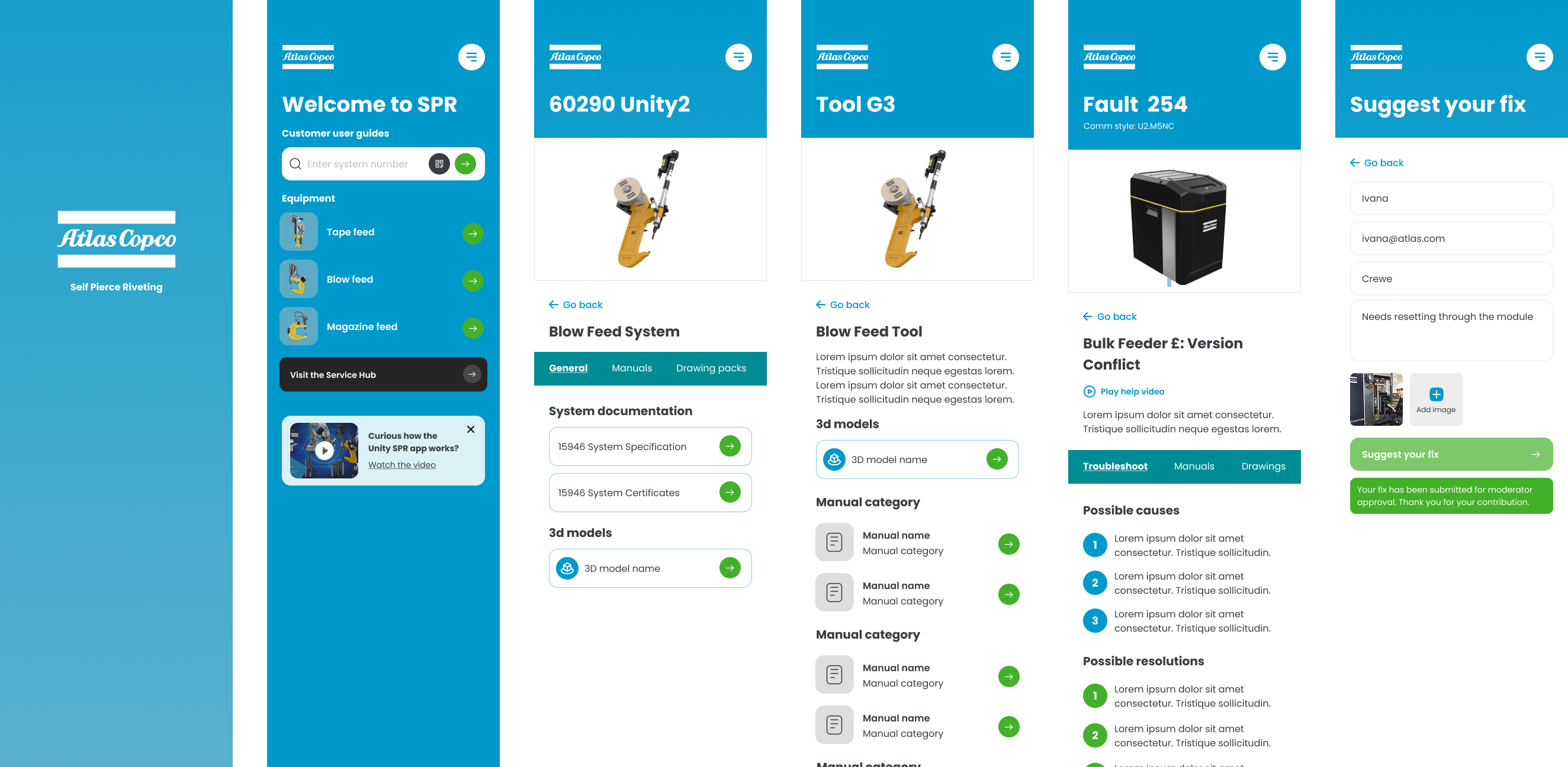
Self Pierce Riveting equipment is used on production lines in factories around the world. When a fault occurs on a live line, every minute of downtime has a direct commercial cost. Engineers needed a fast, reliable way to diagnose faults, follow resolution steps and access up-to-date maintenance documentation without leaving the factory floor or waiting for specialist support.
The tool that existed before this was a collection of PDFs, printed manuals and tribal knowledge. None of it was fast enough, none of it was consistent across sites, and none of it worked in the moment a fault needed fixing.
I worked on this as a freelance designer, responsible for the full UX and UI from brief through to handoff.
Designing for the Factory Floor.
Designing for a factory floor is a different problem from designing for a consumer audience. Users are under pressure. They may be wearing gloves. The environment is noisy and visually busy. The stakes for getting it wrong are immediate and measurable.
That context shaped every decision. Tap targets needed to be larger than standard. Information hierarchy had to be ruthless, the most critical information at the top, nothing buried. The path from fault code to resolution had to be as short as possible because someone standing in front of a broken machine doesn’t have the patience, or the time, for a poorly structured information architecture.
There’s a kind of design work where the aesthetic is the hardest part. This wasn’t that. The hardest part here was understanding what engineers actually needed in the moment of a fault, versus what the business thought they needed, and designing something that served both without compromise.
Working With Reality.
The multi-language requirement was the constraint that shaped more of the design than anything else. The app needed to work across production lines in different countries without requiring separate regional builds. That meant every design decision had to account for text expansion, right-to-left language support considerations, and the fact that some of the most critical interface elements, fault codes, error states, action labels, needed to be immediately understood regardless of which language was active.
There was also a question early on about how much to rely on text versus iconography. In a multilingual tool with a high-stakes use case, the instinct is to lean heavily on icons. The problem with that is icons aren’t universal. What reads as “settings” to one cultural context reads as something else entirely to another. The solution was a combination approach, clear iconography supported by short, translatable text labels, tested against actual translations rather than assumed.
Content management was the other major constraint. The manual library needed to stay current across multiple product lines and firmware versions. The design had to account for that, not just at launch, but as an ongoing operational reality.
The Approach.
Fault code diagnosis was the core function and the starting point for everything. It was designed as a structured search and resolution flow, surfacing the specific fault, its most likely cause and the recommended fix in as few steps as possible. Every additional tap was a tap taken by someone who didn’t have time for it.
Step-by-step resolution guidance was supported by maintenance videos accessible directly within the app, removing the need to cross-reference physical manuals or find a computer. The video integration was a specific request from the engineering teams consulted during discovery, who were clear that written instructions alone weren’t sufficient for complex fault resolution in a high-pressure environment.
Equipment manuals were integrated in their entirety, version-controlled and searchable, with the multi-language layer applied across all content. The interface was designed to feel immediately familiar to a technical audience, not dumbed down, but stripped of the bureaucratic complexity that plagues most internal tooling.
The Outcome.
The app replaced a collection of PDFs, printed manuals and institutional knowledge with a single, fast and reliable mobile experience for production line teams. Engineers could diagnose faults, follow resolution steps and access maintenance videos without leaving the floor or waiting for someone else to find the answer.
Multi-language support made the app deployable across the international production network without requiring separate regional builds, and the integrated manual library gave teams consistent access to current documentation for the first time.
The broader point is about what this kind of work demonstrates. Internal tooling is often treated as a second-class design problem because the users are captive and the aesthetic expectations are lower. The opposite is true. The stakes are higher because the context of use is more demanding, the tolerance for poor design is lower, and the commercial impact of getting it wrong is immediate and visible.
What I’d Do Differently.
The biggest gap in this project was direct access to the end users during the design phase. I had access to requirements gathered from engineering managers and product stakeholders, which was useful, but it’s not the same as watching someone in a factory environment actually interact with a prototype. The decisions I made about tap target size, information hierarchy and navigation depth were informed by design principles and the briefing rather than observed behaviour. Most of them were probably right. I’d have more confidence in all of them if I’d been able to validate them in context.
I’d also have pushed harder for a post-launch feedback mechanism built into the app itself. The people best placed to tell you whether the fault resolution flow is actually working are the engineers using it on a Monday morning when something breaks. Building that channel in from the start would have given the product team something to work with beyond the initial launch metrics.