Wellness Without the Overwhelm.
UX and UI design for an award-winning fitness and wellness app serving businesses and individuals.
The Challenge.
ARVRA is an award-winning fitness and wellness platform serving both individual users and corporate clients, providing affordable, personalised and human-centred tools in a market crowded with impersonal, one-size-fits-all solutions.
The design challenge was threefold. New features needed to reflect what users genuinely wanted from a wellness solution, not what the market assumed they wanted. The experience needed to balance innovation with familiarity, introducing new functionality without creating friction for users navigating personal wellness routines. And with content potentially visible to millions of users, the design had to instil confidence and encourage engagement at scale.
The long-term commercial success of a wellness app is built on retention, not acquisition. That framing shaped every decision. The design had to make the app genuinely worth coming back to, not through dark patterns, but through experiences that added real value to users’ daily lives.
I worked on this as a freelance designer, responsible for the full UX and UI across the consumer and corporate product.
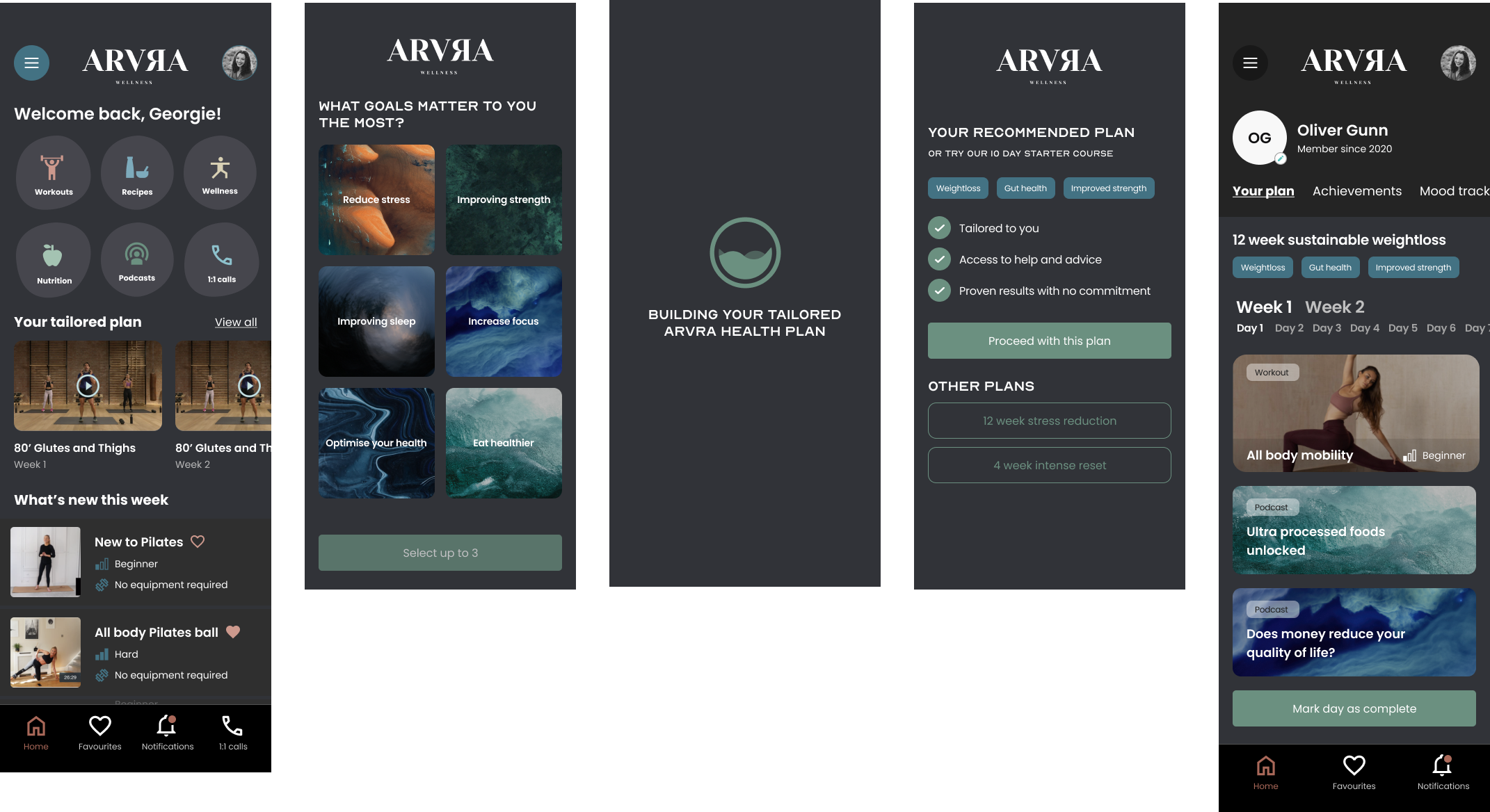
The Approach.
The wellness space is saturated with complex, feature-heavy products that overwhelm users rather than supporting them. The design direction was built on the opposite principle, progressive disclosure of features, with simplicity as the default state. Every screen had to earn its complexity.
The UI was designed to feel familiar from first use. Intuitive navigation patterns, clear visual hierarchy and a calm aesthetic that reflected the wellness context without feeling clinical. New features were introduced in a way that felt additive rather than disruptive, building on gestures and layouts users already understood rather than asking them to learn something new.
Retention was treated as a first-class design problem rather than an afterthought. The instinct in fitness apps is to front-load the data, streaks, progress rings, completion percentages. The problem with that approach is it makes people feel bad on the days they don’t perform. The engagement mechanics here were designed to encourage rather than pressurise, programme tracking and personalised content that gave users a reason to open the app even on a rest day.
The design covered the full mobile experience end to end, across both the individual user journey and the corporate tools that form a significant part of ARVRA’s B2B offering. Those two audiences have different needs and different contexts of use. Designing for both within the same product without either feeling like a compromise was one of the harder problems on the project.
The Moment It Wasn’t Obvious.
The B2B and B2C tension was the most uncomfortable design problem on this project. Corporate clients want visibility, reporting, usage data and the ability to see how their employees are engaging with the platform. Individual users want privacy, a sense of personal ownership over their health data and the feeling that the app is for them, not for their employer.
Those two things are in direct conflict and there’s no design solution that fully resolves it. The approach was to be explicit about the boundary rather than hide it. Users could see clearly what their employer could and couldn’t access. That transparency was a design choice, not a legal requirement, and it was the right one. Trust is harder to rebuild than it is to establish.
The social features presented a similar tension. Sharing workout activity and progress with other users is a proven retention mechanic. It’s also something a meaningful proportion of users find actively off-putting. The solution was opt-in social visibility at a granular level rather than a single on/off toggle, designed to surface the value of the feature without making non-participation feel like a disadvantage.
The Outcome.
The app launched to a strong reception, accompanied by industry events and endorsements from professionals across the fitness and wellness sector. ARVRA’s award-winning positioning was reflected in the quality of the product experience at launch.
The design covered the complete mobile app across iOS and Android, from onboarding through to programme creation, tracking, social features and the corporate wellness tools. Every screen was designed to support the brand’s core promise, a human-centred, affordable and genuinely effective approach to wellness for both individuals and the businesses investing in their people.
Development continued beyond launch, with the next phase of feature work building on what the initial release established.
What I’d Do Differently.
The granular social visibility controls were the right answer but they were added relatively late in the design process. If I were starting again I’d have brought that problem to the table earlier, because the implications of the opt-in model rippled through a number of other design decisions that then had to be revisited. Getting that architectural decision made early would have saved time downstream.
I’d also have pushed for a more structured onboarding research phase before UI design began. The assumption going in was that wellness app onboarding is a solved problem and we could reference established patterns. That’s broadly true, but the B2B context introduced edge cases around account setup and employer-linked access that standard patterns didn’t cover well. A round of research specifically on the onboarding journey for corporate users would have surfaced those edge cases before they became design problems mid-sprint.